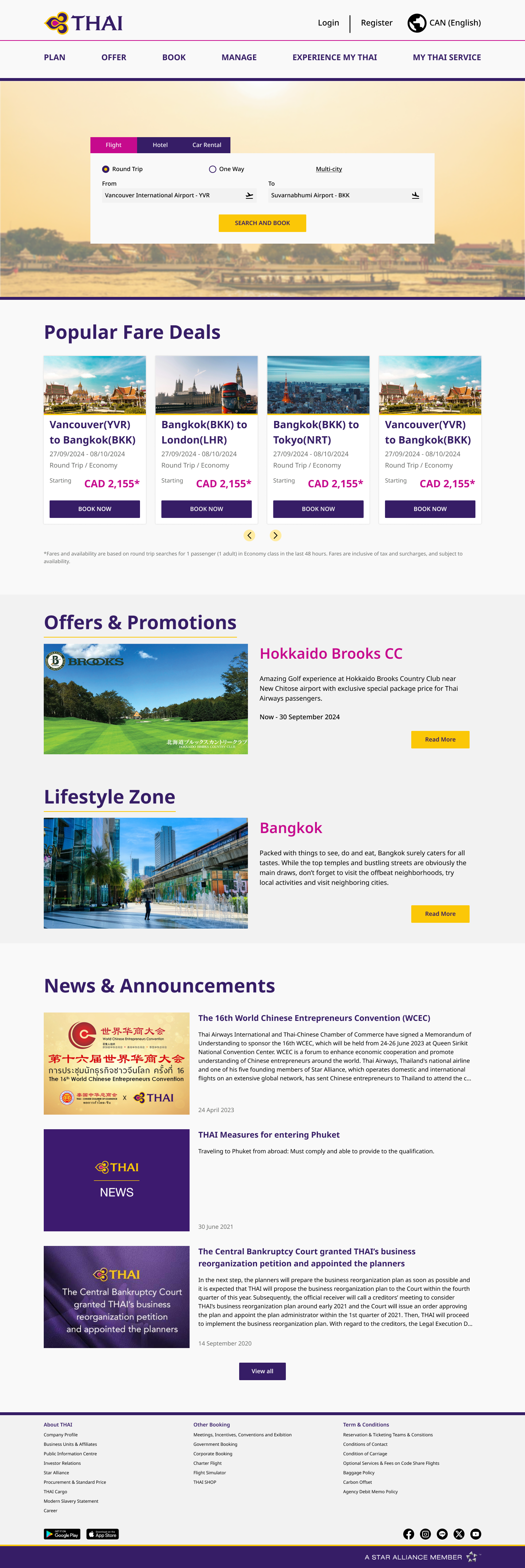
Thai Airways, the flagship carrier of Thailand founded in 1960, has services through their platform to provide comprehensive travel solutions to passengers.
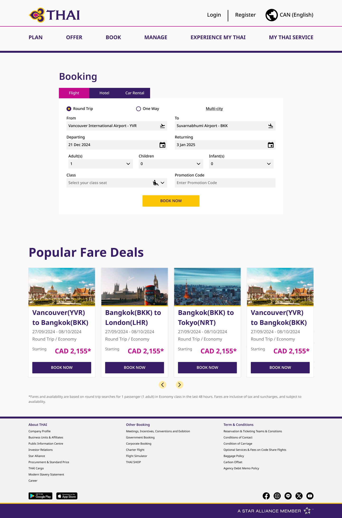
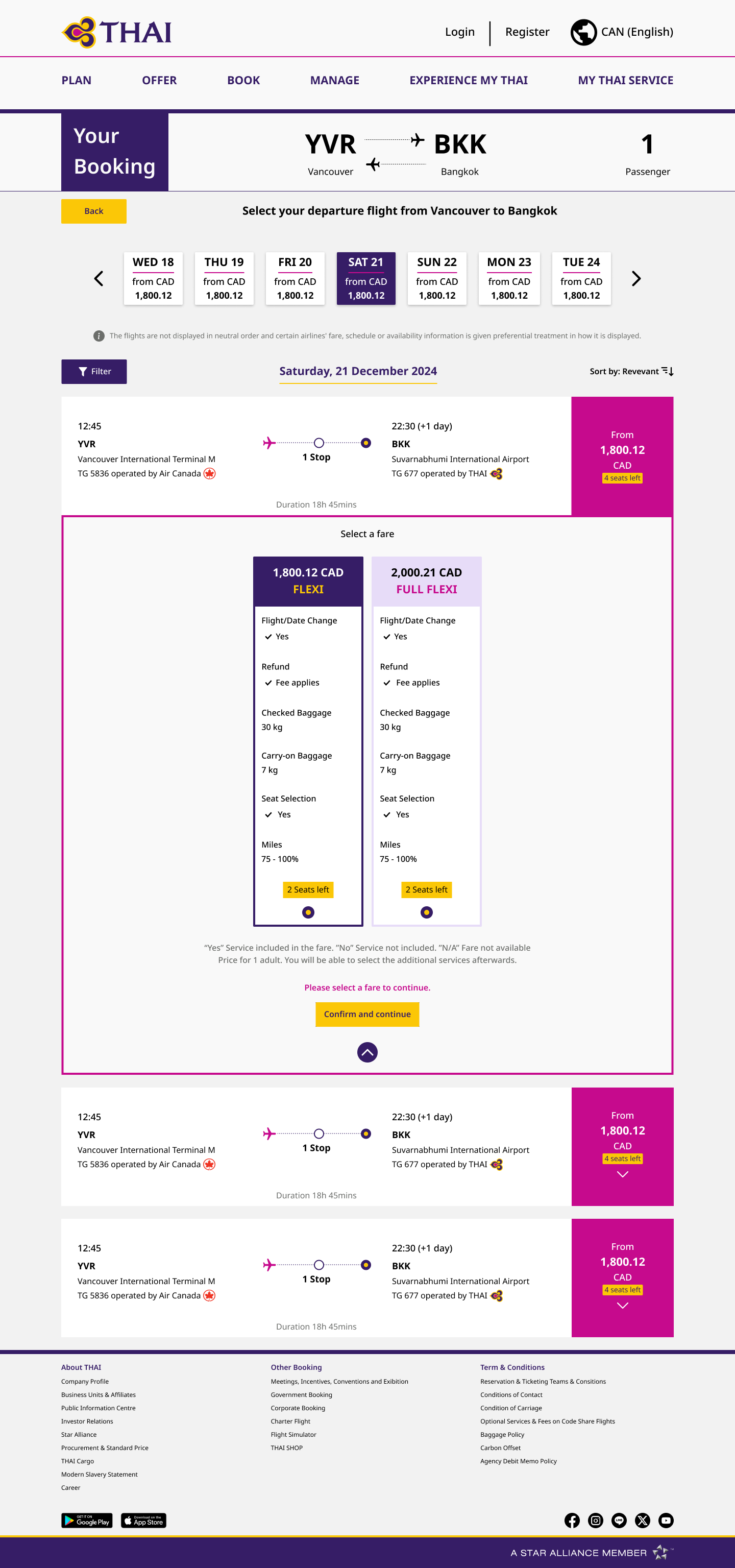
Their website facilitates easy flight bookings, allowing customers to search for flights, compare prices, and make reservations seamlessly. Additionally, the platform offers online check-in services, enabling passengers to check-in for their flights and select their seats in advance, thus saving time at the airport.
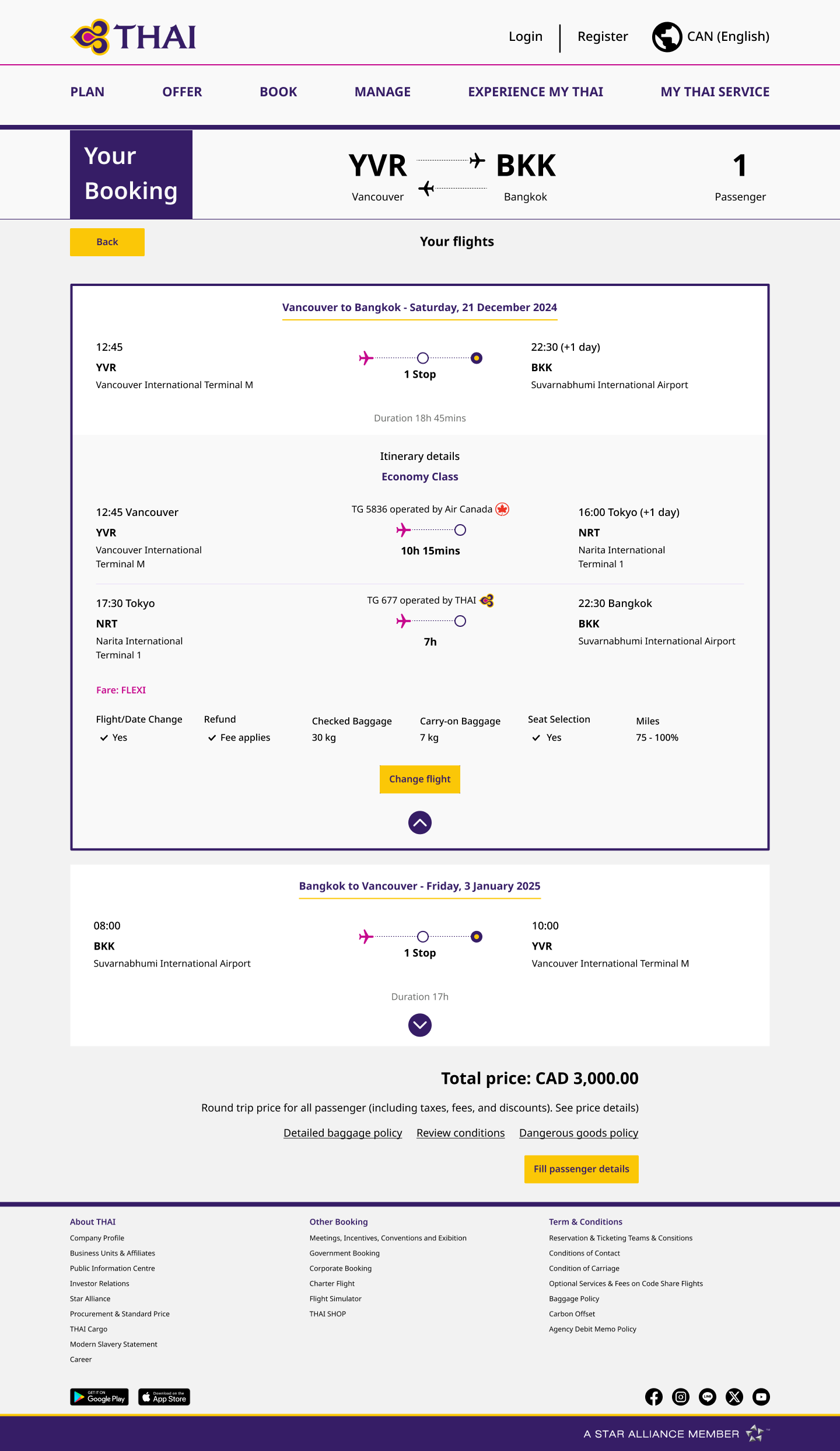
The current design looks outdated, lacking the visual attractiveness that modern online designs normally present. This can affect the overall user experience, making the platform feel less engaging and trustworthy. In addition, several sections and elements on the page are difficult to read due to small font sizes and a lack of contrast between text and background. This can strain users' eyes and make it difficult for them to absorb important information quickly.
The spacing between each section is also inconsistent, contributing to a cluttered and disorganized layout. When components are not properly aligned or spaced, they distract the page's natural flow, making it more difficult for users to browse and identify the content they are looking for. This issue might cause users may struggle to distinguish between sections or identify the most relevant information.
Moreover, the font weight does not allow for comfortable reading. Thinner typefaces can fade into the backdrop or become nearly invisible, especially on high-resolution screens or in low-lighting settings. Increasing font thickness would make the text more visible, enhancing readability and making the website more accessible to a wider range of users, including those with visual impairments.
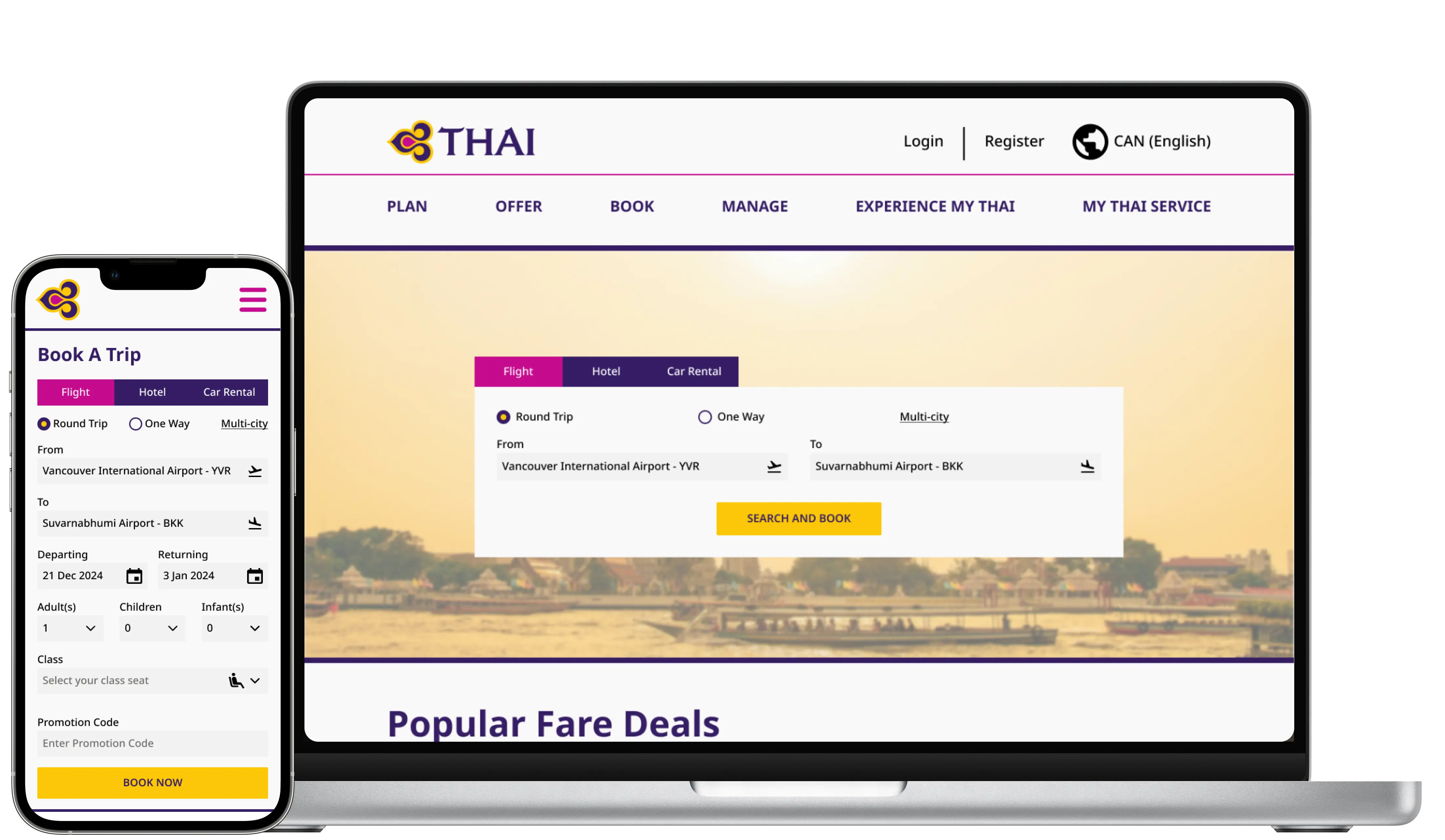
The issues with the current design can be addressed by implementing a few key changes to enhance readability and improve usability. First, increasing the font weight will make the text more visible and easier to read, particularly for significant headings and calls to action. This change will lessen eye strain and make the information accessible to a wider variety of people.
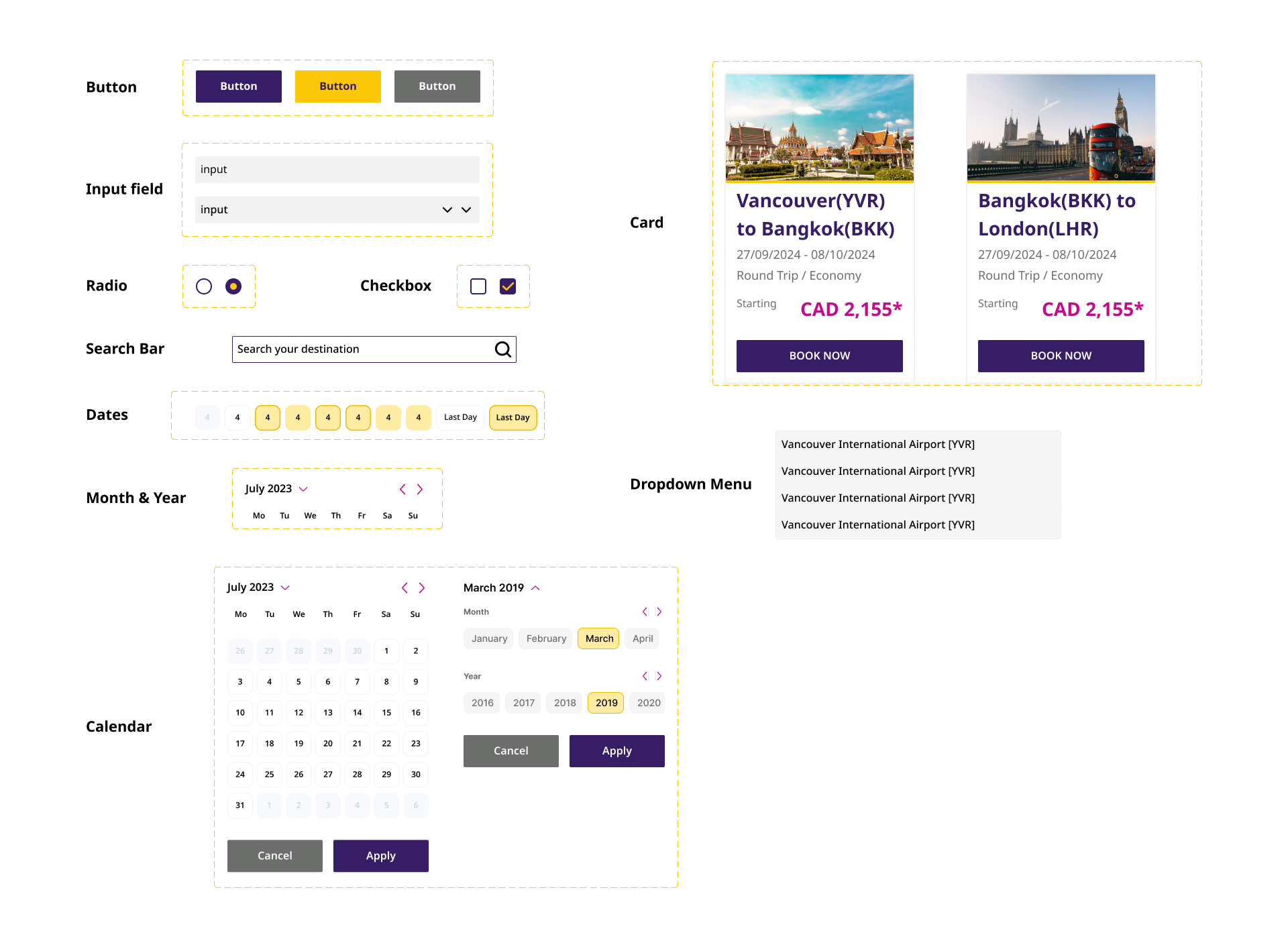
Next, changing the components to be modernized gives the platform a new, updated design. By introducing modern design elements like cleaner lines, updated icons, and streamlined layouts, the website will be more engaging and in keeping with current design trends. This change will also help to retain continuity with the brand's identity.
Lastly, properly spacing each element will improve the layout’s organization. Consistent space between sections will result in a clear visual hierarchy, allowing users to easily navigate the page and find the information they need. This spacing will also help to create a more balanced and attractive design, improving the overall user experience.
#361D66
#C60A8D
#FBC707
#F5F5F5
