
MemoryExpress is one of Canada's top electronic stores, known for its wide selection of computer hardware, electronics, and tech accessories. They offers a plenty of options to meet consumers needs.
However, The issue with this website is that the original page contains too many components that appear to be distracting, such as navigation bars and banners, which can cause confusion when users visit this page. And there are some elements that repeat on every section of this page such as IPR Replacement, Price Guarantee, Tech Zone, etc.
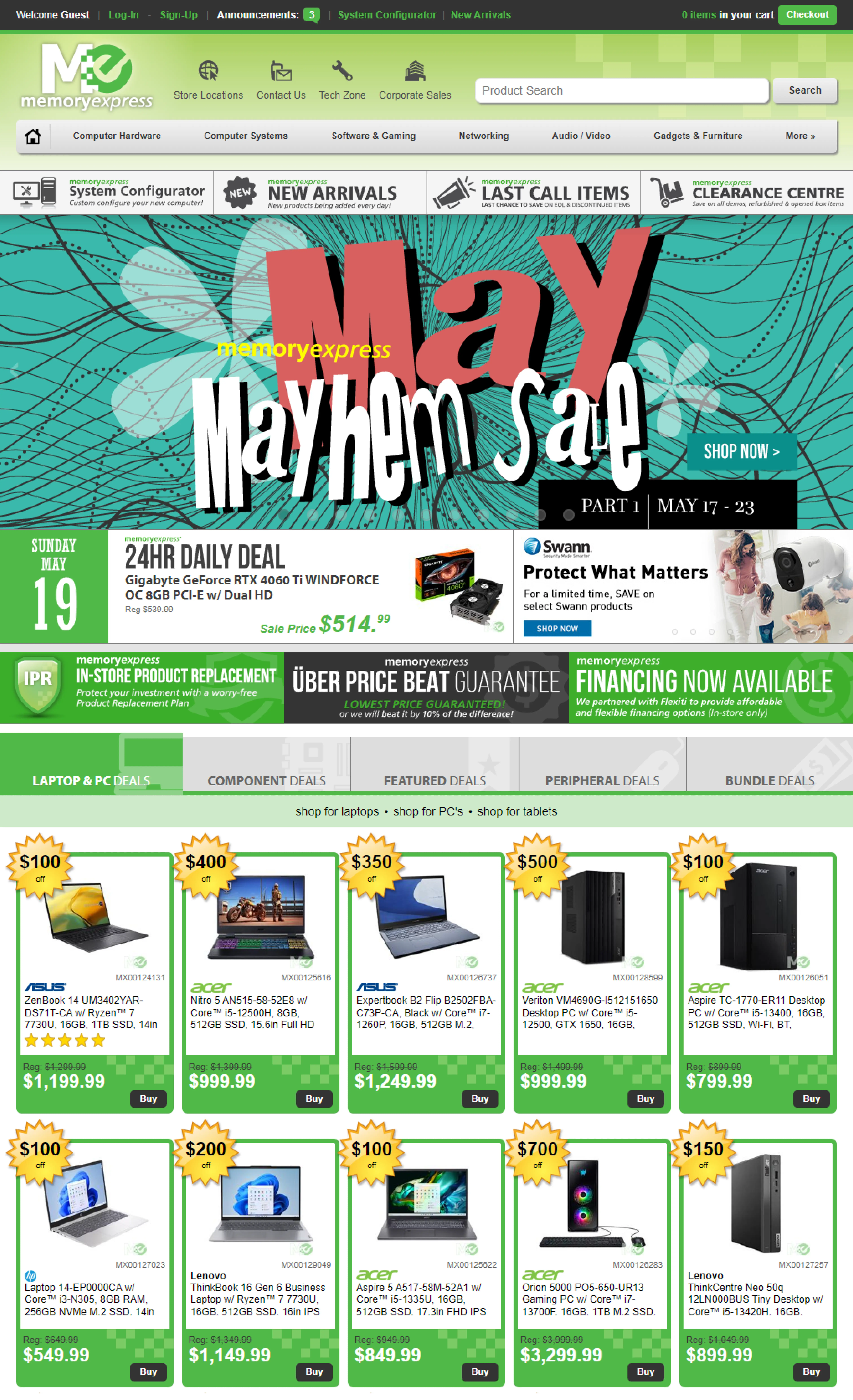
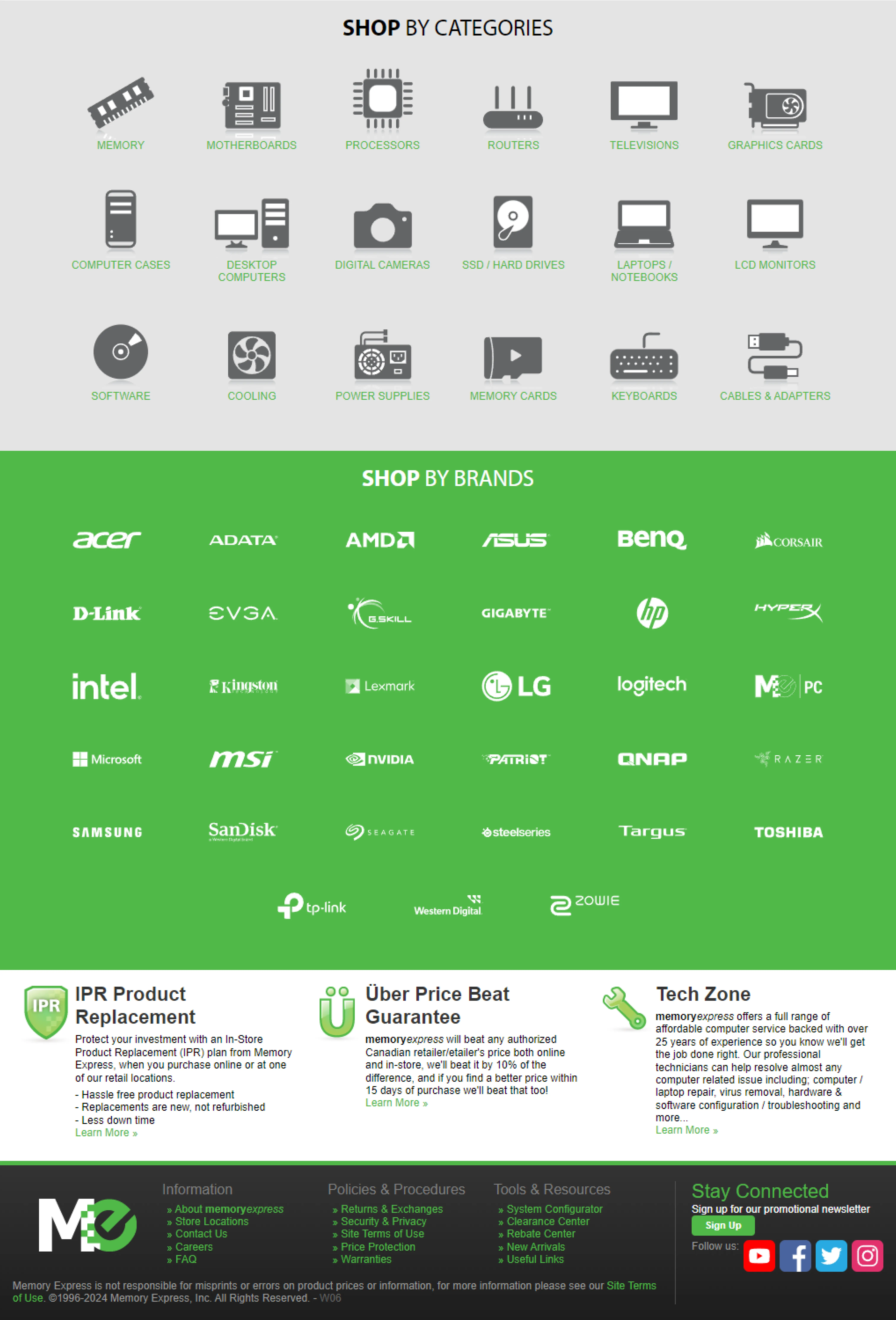
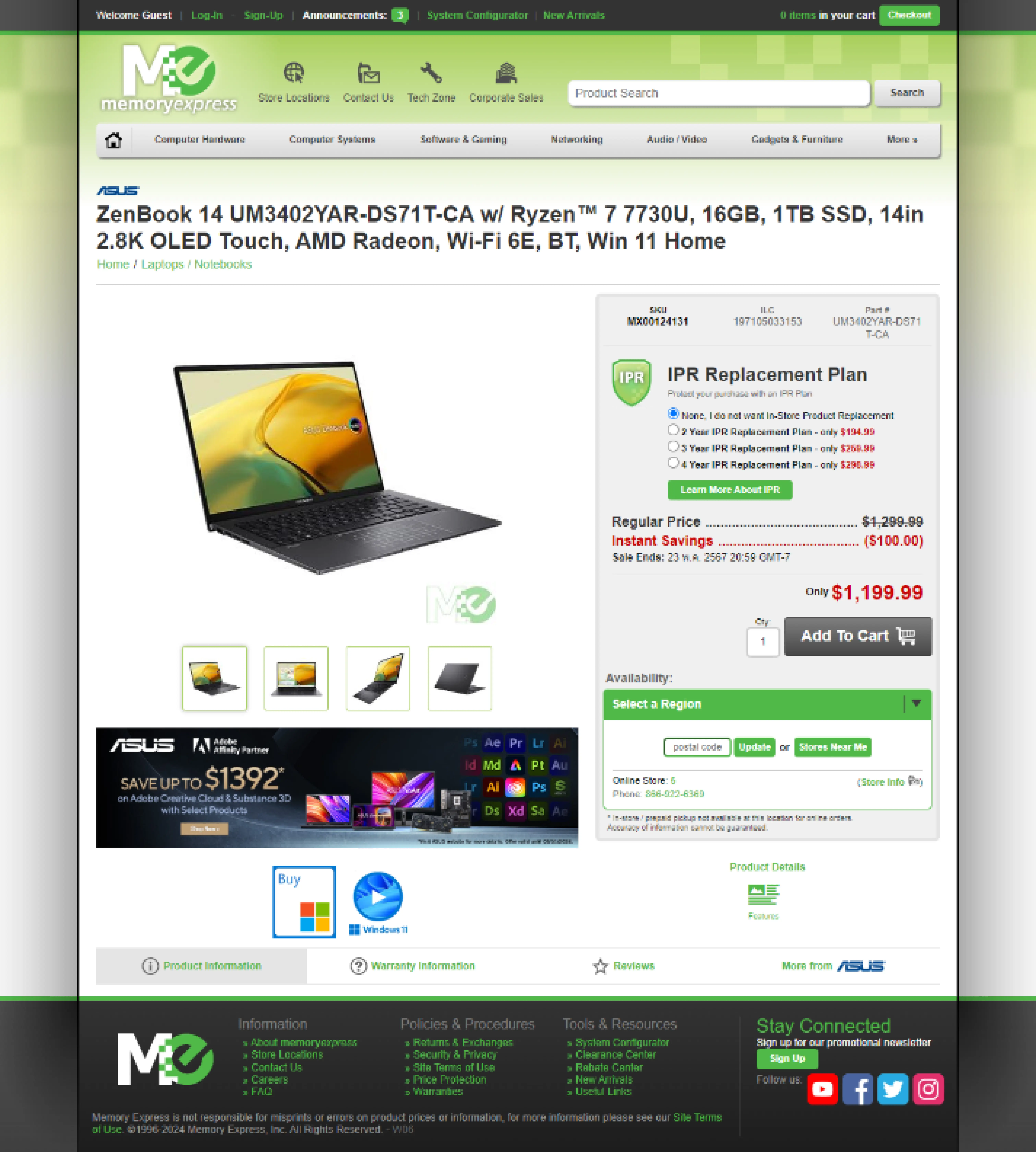
The presence of different navigation bars, banners, and promotional sections can make the structure look cluttered and overwhelming. This can lead to cognitive overload, as users may struggle to find the information they need. Additionally, the website does not have a clear visual hierarchy, making it difficult for users to prioritize content. Key information and calls to action may be buried behind less important aspects, such as repetitious banners or advertising.
Colors, typefaces, and spacing used inconsistently on the website. For example, It is noticable that this website using 2 typefaces which are Arial, and Myriad Pro. Both typefaces is sans-serif. The color of the website's header and body sections differs. One uses a gradient, while the other uses a solid color.
Consistency in these areas is critical for delivering a unified user experience. For example, if various parts of the site use different font sizes or colors for a single component, this might confuse users and detract from the overall design. These can cause readability issues for users.


The website's structure and style are improved by simplifying navigation through menu consolidation and category prioritizing, allowing users to find what they need more easily.
Unnecessary banners are deleted to decrease visual clutter, while necessary banners are properly positioned to avoid distractions. Repeated components are removed to simplify the text and improve the overall flow.
Additionally, increasing the spacing in the catalog results in a cleaner, more scannable style, which improves readability and user experience.
Adjusting color tones to increase contrast improves consistency throughout a website, making content more legible and accessible. This change improves the visual attractiveness while maintaining accessibility standards.
All pages have uniform space and layout, resulting in a unified and professional appearance that leads to a more consistent and user-friendly experience.
#0A8700
#50B948
#D9D9D9
#303030
